Weekend long reads (Dec. 5, 2014)

Readers will notice that there hasn’t been much activity here since Thanksgiving. My absence is partly due to traveling I’ve had to do, being engrossed in my new book (The Power Broker by Robert Caro), and other academic obligations, which will continue next week. Nonetheless, I have provided some long reads here as they seem to one of the more popular types of posts. I hope to have the third part of the series on sectoral investment patterns up by the end of next week.

Fracking tantrums

Banking

Research and academics

Thanksgiving long reads (Nov. 27, 2014)

Happy Thanksgiving! Here are some articles I have lined up to read over the long weekend. Not all are recent; I’m trying to clear out the reading list.

1. The tech worker shortage doesn’t really exist. Bloomberg Businessweek

2. State unemployment map goes monochrome for October 2014. The Economic Populist. [Not actually monochrome, but close: no state observes an unemployment rate greater than 7.9% (US average is 5.9%), although underemployment is a separate problem. Also contains maps for employment-population ratio by state!]

3. Kuroda turns up the heat on Japan Inc.: turn profits into higher wages. WSJ

4. How the world’s most leveraged hedge fund got away with insider trading. Zerohedge

5. Oil at $75 means patches of Texas Shale turn unprofitable. Bloomberg [Good run-down of the economic-geography of fracking profitability]

6. Public relations and the obfuscation of management errors–Texas Health Resources dodges its Ebola questions. Health Care Renewal

7. Boomers, millennials and interest rates: a muni investor’s perspective. BlackRock blog

8. For middle-skill occupations, where have all the workers gone? Federal Reserve of Atlanta

9. Over at Project Syndicate: economic growth and the Information Age: Daily Focus. Washington Center for Equitable Growth

10. Jeff Henry, Verruckt, and the Men Who Built the Great American Water Park. Grantland.com [Schlitterbahn!]

On the book front, I’ve reading The Power Broker: Robert Moses and the Fall of New York by Robert Caro. I’ve been meaning to read it for a while and then found it at the bookstore, so here I go!

The contemporary context of investment in the United States, part 1: introduction

The Great Recession (2007-2009) changed the context for investment in the United States in several ways. First, it created imbalances in the economy, in terms of losses and gains between economic (businesses, households, government) as well as industrial (agriculture, manufacturing, services) sectors. These losses and gains can be measured in terms of lost output, including employment. These are imbalances to the extent that contractions in output were unevenly shared across sectors.

Second, the political environment changed as new constituencies and alliances were formed, while others were made more obvious. An example of such a long-standing alliance that became stronger was the relationship between the Federal Reserve and large, globally-competitive financial companies. This relationship was codified in the emergency recapitalization (the TARP) and in the Dodd-Frank law. New constituencies emerged or became more pronounced, for instance as unemployment and homelessness rose, and they reflected a regional character (for the reason that the financial crisis and recession were, in fact, regional crises). These new constituencies and alliances generated pressures for different kinds of policy intervention, with varying success.

And finally, the macroeconomic context changed, given changes or stickiness in the informal rules of investment (such as tax rates, interest rates, the supply of credit). Similarly, economic development through the application of new technologies, discovery and extraction of fossil fuels, and global capital flows also have shaped the macroeconomic context.

Over the next several posts, I’m going to outline the context of investment in the US immediately before and since the financial crash in 2008. I will describe the nature of investment since the crash, with a focus on the distribution of investment activity between sectors (economic and industrial) as well as the nature of investment (private fixed assets: structures, equipment, intellectual property). Finally, I’ll briefly describe the kinds of companies and regions that were poised to reap the benefits of this changing context, and contrast them against those entities that have borne the greatest burden.

The next posts will frame investment in the US with the following specific questions. First, what do I mean when I talk about investment in the United States? I will outline that question by referencing JK Galbraith’s new book (The End of Normal) as well as borrowing some insights from Hyman Minsky. Let me add that I do not mean to advance any kind of coherent theory; that is way beyond my remit at the moment. Rather, I find it useful to identify useful metrics and relationships in the data that can eventually be situated within a wider theory, or can be used to advance or refute other ones.

Second, what are the current obstacles at the geopolitical and national levels to growth in investment within the United States? Off the top of my head, I can think of several important “obstacles”: the process of domestic credit allocation (including interest rates, integrity of too-big-to-fail banks, property development); the cost of raw materials (especially oil and gas); and, military commitments and the general financing of national security. Readers of Galbraith’s book will notice these topics are quite prominent in his account, while I have spent most of my very short academic career focused on the first.

Third, what is the current progress or state of the economic recovery since 2009? There are some subsidiary descriptive questions that point to my thinking here. Which economic sectors have returned to pre-crisis trends in output growth (contribution to GDP) and which remain stalled? Which industrial sectors? How did investment in private fixed assets respond to the crisis and aftermath? What about for investment in structures, equipment, and intellectual property? (If readers want to see what I’m getting at with these questions, take a look at this article from the NYT back in April: http://nyti.ms/1zZEVct; I am essentially expanding this kind of inquiry, which has been, incidentally, the empirical base upon which most of research has been conducted).

My doctoral dissertation advisor liked to say that a solid way to organize an argument follows the formula: what; why; and, so what. The what component here is really, where is investment happening in the USA (both in sector and locational terms). The why seeks to explain the relevant processes that propel the investment we see or hinder the investment we hope for (particularly, why it should be the case that despite there being a real recovery in material terms, there should be such a slow expansion in quality employment opportunities). The so what for me really comes down to distributional fairness. In other words, something that has been on my mind the last few years is whether the parties responsible for the financial crisis and disappointing recovery were the same parties that amortized its costs, or whether there has been a systemic and successful effort to push those costs onto other parts of society. Additionally, I want to explore the durability/sustainability of the investment that is happening. At the end of the day, we all want to be a part of a successful collective endeavor–the US economy. Hopefully I’ll find much to be proud and excited about as I dig through the data. Alternatively, hopefully I can provide some insight into how to rectify the processes that point to the contrary.

Meso-level analysis using cluster methods: local economic structure among Texan counties, part II

This post continues from the previous one, presenting the empirical findings from the cluster analytical technique.

The four independent variables I settled on as a way to investigate the local economic structure of Texan counties were: urban size, unemployment (rate), poverty (rate), and the share of oil and gas employment in total employment. This selection captures generalized urban economies that arise from large size as well as diseconomies (unemployment and poverty), and a degree of specialization (in an industry of some importance to the state). Unemployment and poverty, by the way, are very different phenomena. Unemployment does not necessarily imply poverty, and vice-versa. Unemployment refers to civilians of adult age who could be in the labor force but are not (perhaps because they are not qualified for available work, for instance). In contrast, individuals in poverty may be gainfully employed, except that they have fewer opportunities for social advancement, are socially ostracized, and their incomes are so low and posses so few material possessions that they have difficulty feeding and clothing themselves without assistance.

Local economic structure, thus, reveals in broad terms the allocation of economies and diseconomies from urban size and specialization. Once emplaced on a map, we may be able to determine the spatial structure of the economy as well. The rest of the post presents the findings from the k-means cluster analysis.

Cartographic introduction

Before diving into the cluster results, however, it is important to provide a more basic introduction to the geography of Texas. The first map below records the population distribution by county (absolute numbers). Consider that with the exception of the far west, counties in Texas are all roughly the same size. This curious feature makes it easier for us infer population density and hence urbanization from the following map. There are a number of important points to draw out here.

  1. Houston is the largest urban area in Texas, with more four million people living in the core county of Harris; activity spills out from Houston into at least four adjacent counties
  2. Dallas-Fort Worth is the next largest, with two heavily populated counties surrounded by less populated areas, ostensibly suburbs.
  3. Central Texas features San Antonio and Austin as part of a rather long chain of urban areas pointing towards Dallas, with San Antonio at the bottom of the chain, and Austin closer to the middle.
  4. Outside of the more densely populated eastern portion is the south, which include Corpus Christi and Brownsville.
  5. In the far west is El Paso, which is almost as much a part of New Mexico as it is Texas.
  6. Several counties are scattered throughout the panhandle, where there is oil and gas extraction.

tx-pop

I have also included a map of the distribution of the Hispanic population in Texas. I do this in order to head off any attempt to associate the location of Hispanic people and unemployment or poverty. In almost half of the counties in Texas, over fifty pct of the population are of Hispanic descent.

hisp

The feature that stands out most in comparing the total population and Hispanic population distributions is that the latter does not cluster in major urban areas. Instead, the main factor is proximity to the border with Mexico. This pattern stands in contrast, for example, to the distribution of black Americans in urban areas in the North during the last mid-century. Urban areas do not appear to be sites of particular concentrations of a given demographic group, in other words.

Finally, I present the results of the cluster technique described in the previous post.

tx-c8a-beta

There is quite a bit of information that needs to be parsed here. The first point is to note the frequency of each cluster group and their basic identities. The table below shows the frequency and the mean for each cluster group of the four dependent variables (population, unemployment rate, poverty rate, and share of oil and gas in total employment).

Cluster group Freq. Population Unemp. rate Poverty rate Oil and gas employment share
1 1 4,205,743 5.40% 18.63% 2.85%
2 34 31,413 5.29% 26.49% 1.14%
3 8 171,535 11.16% 32.08% 0.04%
4 25 208,060 5.19% 10.81% 0.94%
5 4 1,773,114 5.10% 17.97% 0.37%
6 58 16,835 3.46% 13.03% 4.63%
7 35 56,846 7.14% 20.75% 0.15%
8 89 39,826 4.83% 18.59% 1.02%
Total 254 100,199 5.14% 18.33% 1.70%

Cluster group 1 is clearly central Houston and cluster group 5 is the central areas of Dallas-Fort. Worth, San Antonio, and Austin. The next smallest group is cluster group 3, with 8 non-urbanized counties located along the border with Mexico. Cluster group 4 is the fourth smallest group, and it seems, based on the map, that these are suburban areas. It seems rather interesting that suburban areas of at least six metropolitan areas can be identified on the basis of the four dependent variables. This indicates there is uniformity in economic structure that relates to an area’s position within the urban hierarchy. All other cluster groups have memberships greater than 34 counties, the largest being the final cluster group (8) with 89 counties.

A glance at the map emphasizes that clustering is a common phenomena for almost all groups. This is especially the case for: group 8 in the central part of the state; group 7 in the eastern and northern parts of the state (a long chain of counties registering as 7 stretch from the border with Louisiana up to Dallas); group 6 in the panhandle and northwest of Dallas; and groups 2 and 3 along the border with Mexico.

For discussion, I think the most pressing question would be what are the differences between the most populated groups (particularly 2, 6, 7, and 8). Referring back to the above table, we can categorize those clusters as such:

  • Group 2 are small, poor areas with some oil and gas activity.
  • Group 6 are even smaller areas with low unemployment, relatively low levels of poverty and a substantial amount of oil and gas activity. Ostensibly, these counties observe an economic specialization in oil and gas extraction, and, being underpopulated, probably draw in skilled migrants for temporary work.
  • Group 7 counties are on average slightly larger than group 2 and 6 counties, but have higher rates of unemployment and poverty than group 2, which might be attributed to the very low presence of oil and gas.
  • Group 8 counties are slightly larger than group 2 counties, with slightly lower levels of unemployment and poverty, but also less oil and gas presence.

Obviously, we quickly encounter the explanatory limits of the four dependent variables. Thankfully, I collected more data than ended up going into the determination of clusters, so it is possible to fill out the analysis a bit more. Specifically, we can present the number of bank offices, deposits per capita, and median income. These indicators can reveal the financial characteristics of the clusters, such as access to financial services and accumulated personal savings. We should not necessarily expect that estimated median income will mirror deposits per capita precisely, for the reason that spending and saving patterns will vary between areas due to cost of living differences in addition to varying access to financial intermediaries. For instance, wealthier areas may hold their savings in 401(k) or brokerage accounts as well as bank deposits, while poorer areas may hold savings in cash. Other areas probably send savings back to Mexico in the form of remittances. So the financial indicators can raise some interesting hypotheses (again, cluster analysis does not manufacture evidence that allow us to make statements of causality; this is purely exploratory).

Cluster group Est. median income Bank offices Deposits per capita
1 51,298 1024 50,241
2 35,197 10 20,600
3 30,274 34 10,220
4 62,475 54 14,240
5 52,579 431 36,130
6 49,825 7 30,421
7 38,919 13 14,364
8 40,613 14 20,078
Total 43,815 27 21,209

I will take each cluster group in turn.

  • Group 1 is central Houston, which as a median income almost 20 pct greater than the Texan average as well as the most number of bank offices and the largest stock of deposits per person, almost equal to estimated median income. I should note anecdotally, by the way, that the major urban areas do not necessarily have greater deposits per capita than rural or other areas. This really is a matter of financial literacy and access, which in turn is structured very differently between regions and demographic groups.
  • Group 2, a relatively poor grouping, has the lowest average median income, the second fewest average number of bank offices, but its average deposits per capita is roughly in line with the Texas average.
  • Group 3, along the Mexico border, which also had the highest rate of poverty, has lowest average median income, and the lowest average deposits per capita. However, it has a high average number of bank offices. One might be tempted to say that the number of bank offices reflects remittance activity, except that most banks in the US do not offer this kind of activity, but rather face a number of non-regulated, pseudo-bank competitors (wire services). So, I’m not sure how to interpret that high number. It may be the case that these banks are unit (stand-alone) banks, unlike the nationally-recognized banking conglomerates, who would be unlikely to locate in such areas anyway, leaving a more competitive banking market.
  • Group 4, the suburbs, have the highest average median income yet one of the lowest levels of deposits per capita. Perhaps this reflects my statement earlier about wealthier households having access to a larger and more sophisticated range of financial products, which would mean they put fewer of their assets in bank accounts. Another alternative is that their wealth is accumulated in material things, such as residential property, fixed assets if they are business owners, and other ‘stuff’. Perhaps they finance their expenditures with debts and mortgages as well, creating financial obligations that draw their money away from savings and into regular interest payments.
  • Group 5, the urban cores, are also high income areas, with an exceptional number of bank offices on average.
  • Group 6, mainly in the panhandle, based on the low readings of poverty and unemployment, appear to be relatively successful rural communities. The median income in the average group 6 county is over ten pct greater than the Texas average, with a high level of savings (deposits per capita). Furthermore, this group contains the lowest number of banks offices, which suggests an uncompetitive but perhaps stable banking system.
  • Groups 7 and 8 are quite similar, featuring lower incomes, deposits per capita, and number of banks than the Texas average.

A final indicator I would like to include is total job creation. Here, I simply took the average quarterly number of jobs created (job gains less job destruction) between 2009Q3 and 2013Q3 for each county. As a point of reference, I also calculated job creation as a share of total employment, to account for urban size.

Cluster group Avg. quarterly job growth Job growth relative to urban size
1 17,484 0.90
2 78 1.15
3 273 0.70
4 556 1.15
5 6,750 0.85
6 87 1.65
7 122 0.74
8 97 0.87
Total 320 1.09

The main point from the job growth figures is that the greatest relative amount of job growth was happening in clusters 2, 4, and 6. Recall that these are, in fact, quite a disparate group: group 2 is one of the poorest in terms of work opportunities and high rates of poverty, while group 6 are major oil and gas centers. Group 4, meanwhile, the suburbs, have comparatively low oil and gas presence but are generally wealthier. It is likely the case that further disaggregation of job creation statistics would be necessary to determine the quality of these jobs.

That concludes my case study using cluster analysis. After completing posts like this, I often sit and wonder to myself, “Now, just exactly why did I do all of this?” The point, for me anyway, is that context is important. Given the major economic and political themes going on in the US right now–fracking, the uneven recovery, the ongoing foreclosure crisis, immigration, too-big-to-fail, the competitiveness of US industry–it is as important to know the location and context of such events in order to further our understanding of why these topics are important, to whom they are important (in the sense that some groups will benefit from certain kinds of economic processes while others will bear the burden of them), and the long-term ramifications. Eventually, I am going to revisit the posts I have written on Texas and the oil and gas industry and try and bring together some of my insights into how that industry is shaping the US economic landscape.

Meso-level analysis using cluster methods: local economic structure among Texan counties, part I

Quantitative analysis is never as neat and tidy as one would like it to be. At least, I’ve found that it is often hard to be graceful when you’re dealing with large amounts of data, with the need to clean it up, transform it, present it, and, finally, interpret it. And, then, of course, there is the issue of documenting your process and method, which can also be tedious. Data management and analysis are hard-to-master art forms.

Especially with geography, where you typically are looking at multiple aspects of a large sample of places, presenting the greatest amount of relevant information in the most convincing way to an audience makes for a messy task. Not only is it messy in the planning and development stages, but this carries on all the way to presenting it. (Life would be so much easier with a word processor like LaTeX, which gives much more control over presentation to the writer, except that so many people still use and edit documents collaboratively, which LaTeX doesn’t make easy).

My purpose here today is to share my workflow process, including its shortcomings and how I would like to improve it, as well as to continue the analysis of Texas, which I seem to be fixated upon at the moment. In this post, I outline my workflow process. In a subsequent post, I will present the data.

The method I describe here is cluster analysis. Cluster analysis is a technique that in theory condenses a tremendous amount of information for easier access, yet in practice is quite messy. Essentially, cluster analysis groups objects based on their similarity. It is mainly an exploratory technique, useful for generating hypotheses. There are many potential algorithms for sorting the observations. In a chapter of my dissertation, I used a hierarchical method, which began with all observations in their own cluster and then aggregated two clusters together at each stage. This process avoids the issue of selecting in advance the number of clusters, and employs ANOVA to determine the optimal distance between clusters with the aim of minimizing the sum of squares of a given pair of clusters. The method strives for maximum internal homogeneity in each cluster based on the dependent variables. Other post-estimation techniques are available to confirm the optimal number of clusters.

Here, I use k-means clustering, which has three steps. First, the number of clusters is specified. Second the location of each cluster is initialized. Third, each object is attributed to the nearest cluster. Convergence is achieved when the algorithm can no longer change the assignment of each observation for an optimal fit. It should be noted that, in this way, k-means clustering can group the same set of observations differently on each independent attempt. That is, I could run the same process today and discover an entirely new membership for each observation. Another main difference between k-means and hierarchical methods is that in the former the number of clusters are designated in advance. There are also differences in post-estimation tests.

Let me now move on to the more mundane aspects.

My workflow process

Here is the process by which I assembled data and performed a cluster analysis.

  • Data collection
    1. I gathered data from four datasets: employment (Quarterly Workforce Indicators, www.ledextract.ces.census.gov); unemployment (Bureau of Labor Statistics, http://www.bls.gov/lau/); poverty and income (Small Area Income & Poverty Estimates, US Census, http://www.census.gov/did/www/saipe/data/statecounty/); and, number of banks and deposits (from FDIC Summary of Deposits, https://www2.fdic.gov/sod/).
    2. The geography was Texan counties, of which there are 254 (big sample).
    3. I downloaded the relevant data for the most earliest available date, which differs somewhat between each dataset. Sometimes the data were not all available for all observations, so I retrieved the earliest dataset that had complete data.
      1. Employment data: end of 2012
      2. Population (total size, Hispanic): end of 2012
      3. Unemployment: June 2014
      4. Banking: June 2014
    4. I then merged each of the datasets using STATA and saved this as the master file.
  • Running the cluster analysis
    1. The first step is to standardize the variables, in order to place all variables on the same scale and to prevent distortions.
    2. There was a long trial-and-error process here, where I would select various combinations of variables and then perform post-estimation tests and create maps to determine what worked best. Bear in mind, I am trying to sort counties according to local economic structure, which explains why I initially included different sectors. To make a long story short, I ultimately prevailed upon four variables: total population; the unemployment rate; the poverty rate (all ages); and, the share of oil and gas employment in total employment (all variables were standardized). Often, the maps produced from each iteration would just not seem right, so I would return to the drawing board and repeat the process. Scrutinizing a map may not sound particularly scientific, but the bigger problem is that there is no hard rule about what constitutes an appropriate threshold for the post-estimation tests, so my subjective knowledge is as valid as a seemingly objective mathematical test.
    3. For each set of variables, I would always run the analysis with at least two and at most 13 cluster groups. I would then invoke a cluster stop rule, which produces an F-index. When comparing the F-index values for each cluster, the point is to locate the highest values. You would then gather the cluster groups with the greatest F-index values and look at the frequency with which observations appear in each group (for example, important questions here are: does one group have almost all the observations, or are there many groups with only one observation?). Then you could summarize the means of the dependent variables for each cluster and see how different they are.
    4. Then, if you really wanted to be rigorous, you could run ANOVA tests with the cluster group identifier as the independent variable regressed on each of the dependent variables (population, unemployment, poverty, oil/gas). A statistically-significant F-test in ANOVA can tell us whether or not the clusters are distinct from each other. However, again, there are no tools that have been recognized by scientific consensus as being the most accurate or reliable in determining the number of clusters. Some users of cluster analysis would pursue further statistical techniques, whereas my choice is to generate maps and utilize my knowledge of geography to gauge reliability.
    5. I will justify the selection of the four variables in the next post.
  • Creating tables and maps to present the information
    1. The final cluster analysis I performed identified eight cluster groups for the four dependent variables. I created several tables:
      1. One to show the mean values of the dependent variables, as well as number of counties, for each cluster group.
      2. Another to show the mean values on a set of variables not used in constructing the cluster schematic, partly as a further test of robustness but also as a means of analysis.
      3. And finally, a table showing the average quarterly change in number of jobs (not employment; this is the flow measure for ‘job creation’)  from 2009Q3 to 2013Q3. Again, including this data allows for a comparative analysis for hypothesis-testing.
    2. I exported the county identifiers as well as their cluster group identities into a .csv file and then converted that file into a .dbf file. This step is necessary for correctly adding the county cluster identities to a shapefile for Texas counties. I combined the .dbf file with the shapefile using QGIS and then moved the new shapefile over to TileMill, where I tinkered with the color scheme and added a legend (TileMill is less clunky than QGIS).

This is the process by which data was collected, tuned up, and applied for the purpose of cluster analysis. In the next section, I present the results and then advance some hypotheses and discuss some thoughts of mine on the workflow process and also the empirical findings.

Employment update: the job creation meme

On the radio yesterday morning, some DJ quoted Hillary Clinton, who recently said that ‘business don’t create jobs’ or something along those lines. The statement is meant, I believe, to reflect the notion that consumers create jobs, through their demand for goods and services. Implicitly, the statement seeks to counter the argument that the governing plutocrats are benevolent and generous ‘job creators.’ I think it was a mistake for left/progressive commentators to adopt this theme, but it is here, so let’s first take a look at the process of job creation and then employment and job statistics. My question is: what do we know about job creation, conceptually and descriptively? The post here is going to tackle the first of these, and I’ll write-up another one with some data later.

Semantics

First of all, businesses change the number of jobs recorded in the formal economy by adding workers to or removing them from their payrolls. We know that businesses ‘create jobs’ because the government counts jobs as the number of workers who are employed by firms. So, purely from a methodological perspective, when we talk about jobs, we are talking about the gains and losses of salaried/employed workers at US firms (and occasionally at government agencies) as reported by payroll data (which in turn are reported to the almighty IRS).

Second, businesses do not want to create jobs. Employees are costly, and employers are really only going to hire a new employee after other efforts to cope with increasing workloads (overtime, or productivity-enhancing strategies, for instance) have failed to relieve the stresses from the rising demand for their goods and services. Clearly, there is an important relationship between demand for a firm’s output and the way that the firm adjusts to this changing demand. It is not necessarily the case that a firm will hire more workers as demand rises. Some owners are incompetent, for example. Some firms enter into long-term contracts that so structure their budgets that they simply cannot hire new workers, while other contracts make firing difficult. There is also a tremendous amount of uncertainty in the economy. The process of hiring and firing may be responding to events that are not fully formed or are ambiguous. So when a firm decides to hire/fire an employee, the process will usually be undertaken in the face of exigent circumstances. Again, business don’t want to do this. It’s expensive, it’s uncertain whether it will solve its workload problems, and it may be based on faulty information about its business prospects.

Third, the hiring/firing process is one of the miracles of the economy. I use ‘miracles’ advisedly because it is, in fact, a process that is extraordinary, a welcome but surprising event, and difficult to be observed or explained. Job creation statistics do not actually observe the hiring and firing process. Remember that those statistics simply count the reported number of employed workers at firms at a given time (beginning or end of the quarter, usually). If you want to actually see the phenomena of job creation, you will need to be either a manager or a (prospective/former) employee. The Census doesn’t see job creation; I can’t see ‘job creation’ happening directly. This is partly semantics, but also it should emphasize the fact that the process is personal and sociological. That is, hiring/firing really comes down to a host of economic, political, and cultural factors that are probably highly specific to context (national, regional, sectoral), with a dose of randomness as well. My point here is, if you really want to understand job creation, then you should absolutely be talking to prospective employees, recently hired employees, recently fired employees, and the people who hire and fire them. Then you can get a sense of how the process works.

These are some preliminary comments. In a post later I will elaborate on how job creation happens between sectors and how it varies depending on the quantitative measures utilized.

Employment update

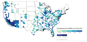
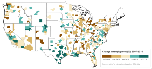
I have created two choropleth maps of the state of employment in US metropolitan statistical areas (MSAs). The first map displays the unemployment rate in about 380 US MSAs. The second displays the percent change in employment (not unemployment) between June of 2007 (before the recession began) and June of 2014 (latest available data). To make the maps a little clearer, I’ve included state and coastal boundaries.

I used data from the BLS (http://www.bls.gov/lau/metrossa.htm), a shapefile from the US Census (https://www.census.gov/geo/maps-data/data/tiger.html), fussed with the data in various spreadsheet programs, and then plugged these variously into QGIS, TileMill, and MapBox Studio. The maps here are a final product of MapBox.

I’d like to able to create and share maps here without always going into the methodology. I add two notes about methodology here that are rather important before discussing the substance of the maps.

Map-maker, map-maker, make me a map

I’ll be the first to admit that my maps are an example of terrible cartography. Part of this comes from my technical inaptitude, but part comes from the decision to look at MSAs. In theory, metropolitan areas are a useful unit to study the structure of economy, but, practically, few people are familiar with their size, boundaries, relative location, and even constituent units. This lack of familiarity with the MSA is compounded by the fact that the unit is not defined in much of a standardized way. For example, Los Angeles MSA consists only of Los Angeles and Orange counties, its population was approx. 12 million in 2010, and its area is 4,850.3 sq. mi., according to Wikipedia. New York MSA, by contrast, consists of 25 counties in over three states, its population was close to 20 million in 2012, and its area is 13,318 sq. mi., also according to Wikipedia. So, we’re dealing with fairly arbitrary statistical creations.

While it may be difficult for most people to really read these maps (that is, to determine what the exact figures are for each and every MSA on the map), there are other patterns that can be picked up on more easily. One example is clustering of similar levels of unemployment and employment change at various scales: within-states or between them, or across larger regions. In my view, the map is not necessarily the final output; it is descriptive, not explanatory. These maps are meant to provide a basic snapshot and starting point for additional, more specific analysis.

And the lights all went out in Massachusetts

You might notice that no MSA located in the New England states is displayed. This absence comes from at least three quirks in US government statistics, which are worth mentioning for the important limits they impose on the maps. First, there aren’t actually any “MSAs” in New England; they are called “New England City and Town Areas (NECTAs).” This immediately introduces some confusion and if you dig around the Census, Bureau of Labor Statistics (BLS), and other US government sources, you’ll notice that New England states, and Massachusetts especially, consistently make odd appearances in federal statistics (often times, figures for these areas are not reported at all, or have a significant delay in their release). I’m not sure what’s going on here. As a result, we lose valuable information especially on Boston, one of the largest US cities, and Connecticut, which contains quite a bit of the US financial and insurance industry.

Second, the shapefiles I used to create the maps use “core based statistical area (CBSA),” which differ somewhat from MSAs. The two units are quite similar. CBSAs are typically amalgamations of “micropolitan” and “metropolitan” areas. The distinction is that metropolitan areas possess a population greater than 50,000. There are over 500 micropolitan areas and around 350 metropolitan areas. The employment data (retrieved from the BLS via the Department of Labor), it seems, covers mainly metropolitan and not micropolitan areas. Although, one of the key problems maybe that the BLS data is in fact organized according to MSAs, whereas the shapefile is organized by CBSA.

Again, the trade-off in using urban-level economies is that the way the data are organized and collected is something of a mess. I think, however, that looking at states does not give the same picture of activity, and nor do counties. And, more importantly, I’m not attempting to be too scientifically rigorous right now.

Final caveat: the maps display only the lower 48 states.

The substance

Let’s begin with the distribution of unemployment as of June 2014.  The worst-performing areas are located in Oregon, California, Arizona, around the Great Lakes (particularly around in Illinois and Michigan), and the southern states (particularly Alabama, Georgia, and Florida). There are several clusters of contiguous metro areas where unemployment is concentrated, including California’s Central Valley, the US-Mexico border region in the southwest, the greater Chicago, Detroit, and Atlanta areas, and also the southern tip of New Jersey (Atlantic City). The best-performing areas include Salt Lake City, the large cities of Texas (San Antonio, Dallas, Houston), and metro areas in Oklahoma, Louisiana, Iowa, Minnesota, and South Carolina.

A few features stand out. First, city size does not imply better or worse unemployment prospects(Chicago and New York versus Houston and Washington, DC, for instance). Perhaps this has to do with the specialized industrial and commercial base of individual areas.

Second, though statistical analysis could analyze this more precisely, just eyeballing the map suggests that the level of variation within states is less than the level of variation between states. That is, there is probably an independent effect of US states, possibly related to differences in state/municipal public spending/austerity, state tax regimes, or to the disproportionate allocation of federal aid to the states. Doing an econometric analysis of metropolitan performance is made trickier when using states as an independent effect, because so many MSAs located on and east of the Mississippi sit in more than one state.

Third, it is apparent that there are regional patterns; that is, some patterns appear consistent across many states. There seem to be three main groups. First, the west coast states as well as Nevada and Arizona; second, the Great Lakes area; and third, the southeast. Possible explanations for the first and third are the high concentration of distress from the collapse in real estate and banking (in the west coast, thrift) markets. Indeed, some of the largest bank failures of the 2008-2010 period were west coast-based savings institutions (IndyMac, Wachovia). Economic structure may also be a factor, such as the high level of specialized industrial activity as a share of total activity in the Great Lakes. However, I was under the impression that California, Georgia, and Florida are actually quite diversified economies (agriculture, industry, FIRE, professional services). Diversity ostensibly delivers greater resilience to economic downturns. So, this issue needs to be fleshed our more.

unemp-2014-june

The next map displays a very different set of dynamics. Where unemployment provides an indication into the mismatch between the civilian population able and willing to work and the supply of jobs, employment growth is actually quite different. At the macro-level, employment growth reflects demographic change, business sentiment, consumer preferences, the savings rate, and there is also an important sectoral component.

This difference in the underlying dynamics explains why unemployment can remain very high, such as in the California Central Valley area, while employment growth is actually expanding. We require more regional- and sectoral-specific data to test whether this discrepancy arises from a skills mismatch (for example, a hypothesis could be that professional or information sectors are expanding while the construction or agriculture industries continue to contract, leaving the comparatively under-skilled workers in the latter unprepared for work in the former) or perhaps because of austerity measures that rationalized the public sector, or perhaps some other hypothesis.

At the very least, we have a reinforced sense of the regional patterns of growth and contraction. Texas, Louisiana, and, to an extent, Oklahoma are growing–this region is one of the main sites of the mineral extraction-natural gas-shale fracking boom of the last few years. The former industrial heartlands continue their long-term process of collapse. The greater New York area registers a contraction, although it seems the worst of it was pushed to the more peripheral areas in New Jersey, Pennsylvania, and the New York suburbs as opposed to the core area. The Washington, DC area–dare we go so far as to include Richmond, VA here?–is booming, so at least austerity has been good to some people.

chg-emp-07-14

Bottom line

There are two chief points I’d like to make, unrelated to the specific content of the maps. First, I think one of the next steps is a set of exploratory econometric analyses that can test the effect of states, proximity between metropolitan areas, industrial structure, and metro-level real estate and housing market distress during the Great Crash of 2007-2009. Cluster-based analytical techniques would also be a useful way of identifying patterns, although neither econometric analysis nor cluster techniques reveal much in the way of explanation.

Second, to get at the causes of differential economic performance would require a series of case studies. An appropriate scale for such case studies, I suggest, is “regional”: not necessarily an entire state, but not necessarily only the areas within a state. Again, cluster-based techniques might be a good first step in deciding which areas are similar or distinct enough to merit study as a group. Interestingly, the Federal Reserve regional banks are a fairly reliable source of this kind of study–each Fed region is composed of three or so states, and every now and then their economists produce a report of regional conditions.