In yesterday’s “2:00 pm Water Cooler” links at nakedcapitalism blog (http://bit.ly/1u1lJ9u), Lambert Strether of Corrente blog (http://correntewire.com/) included a Bloomberg map (from September of this year) of the recovery of employment by state since 2007 (http://bloom.bg/1zM4rC5). Specifically, Bloomberg writers purported to depict the ‘uneven recovery in states post-recession’ by showing the ‘percentage difference between a state’s maximum employment in 2014 and its recession high (reached between December 2007 and June 2009).” They sought to highlight only those states where employment remained below peak levels during the recession, coded using a couple shades of red.
As Strether pointed out, it is a rather confusing map, and I don’t think it conveyed the information in the best way. Why construct a choropleth map that only color-codes poorly performing areas? Why focus on individual peaks in employment during the recession? It would make more sense to depict cartographically the employment changes for all the states and to select a uniform starting date.
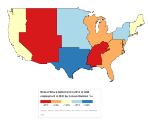
Being convalescent following my recent surgery means I have plenty of time to create some terrible cartography of my own. My topic here is total employment changes at the state level from 2007 to 2013. Descriptively, the question is: which states bore the brunt of the recession in terms of employment losses and which have experienced a recovery in employment. Before going right for the States, I start by presenting the ratio of employment in December 2013 to employment in December 2007 for the Census divisions (of which there are nine). [All data was drawn from the Bureau of Labor Statistics (http://data.bls.gov/cgi-bin/dsrv?sm)%5D.
Recovery can be interpreted in a couple ways. First, it may refer to replacing lost activity, to the point that employment levels in 2013 equal those in 2007. Alternatively, recovery may refer to a kind of resilience. This term can indicate whether an area has returned to its pre-crisis trend, such that not only has that area recovered employment losses but it has added enough jobs that its employment levels are what would be expected had there not been any output losses. To calculate whether an area indeed was resilient and returned to a kind of equilibrium growth (or whether such a return is even possible!) is beyond my remit for the moment. However, the answer to whether an area is ‘resilient’ in this sense or not has much to do with whether there has been structural change in the economy (labor-saving technology, increases in productivity, further transition out of industry towards services). I highly recommend JK Galbraith’s new book The End of Normal for anyone interested in exploring this question.
As a point of reference, the ratio of 2013 employment to 2007 employment for the nation as a whole was exactly 1. The map (for the lower 48 states; Alaska and Hawaii are part of the Pacific division) shows that the West South Central states (Texas, Oklahoma, Arkansas, and Louisiana—major oil and gas states) performed best, with employment bases roughly six pct larger than they were in 2007. These can be deemed resilient. The West North Central (Great Plains states, where there is also quite a bit of fracking activity) and the Middle Atlantic (Pennsylvania, New Jersey, and New York) were second-best performing. The worst were the Mountain states and East South Central (Kentucky, Tennessee, Mississippi and Alabama), whose employment bases remained three pct below their levels at the end of 2007. These areas are clearly not resilient.
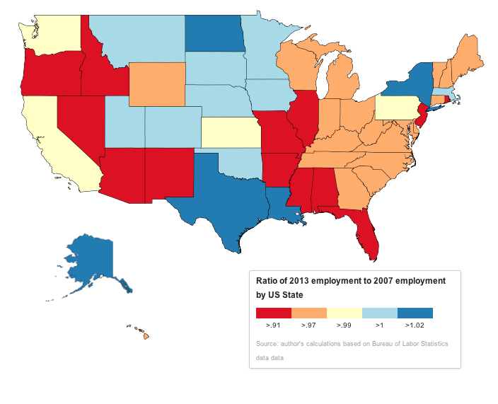
The next map depicts the above ratio of employment levels for all 50 states (maps not to scale). Clearly the Census divisions obscure some important differences within divisions, that is, between states. Census divisions do not always capture coherent economic-units, such as metropolitan areas or industrial districts, particularly in areas along and east of the Mississippi. A more apt unit of analysis for that would be the metropolitan statistical area, however these in turn do not necessarily have a single, coherent governing entity. As such, the US state, with different taxation regimes, varying receipts of federal moneys, bank regulation, local investment and labor force policies, etc, remains an important political-economic unit. The major takeaway, as I see it, is that resilient areas are either oil/gas producing (Alaska, North Dakota and Great Plains more generally, Gulf Coast) or are financial centers (New York and Massachusetts). Meanwhile, the diversified industrial and commercial economies of California, Washington, Virginia, Florida, Georgia, Pennsylvania, and New Jersey remain below their 2007 levels. That is just a hunch. From my academic research, other important factors include exposure to subprime mortgages and the foreclosure epidemic.

The next set of maps show change in employment for two-year increments beginning in 2007.I tried to apportion the states into quantiles, but there were quite a few shared values, and I also wanted to identify some of the outliers. The two-year increments correspond, more or less, with the most recent recession, then a nominal recovery period, and, perhaps finally, a stagnation period. These, incidentally, correspond to the stylized Minskiyan stages of the economic cycle (crisis/crash, recession, recovery, stagnation, economic boom, rinse, repeat). I won’t go into much depth here; I’ll leave readers to gander at these maps to their hearts’ content.
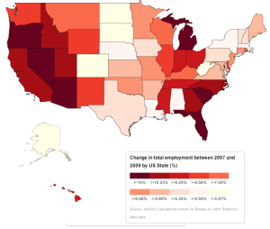
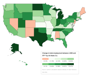

The maps, of course, rely on relative changes. I have also included below a table showing the ten states with greatest absolute employment losses from 2007 to 2009 and then the ten biggest gainers from 2009 to 2013.
| Biggest Losers (from 2007 to 2009) |
| State |
Chg in employment (000s) |
| California |
-1,199 |
| Florida |
-782 |
| Illinois |
-409 |
| Texas |
-403 |
| Michigan |
-402 |
| Ohio |
-401 |
| North Carolina |
-329 |
| Georgia |
-327 |
| New York |
-288 |
| Arizona |
-286 |
| Biggest Gainers (from 2009 to 2013) |
| State |
Chg in employment (000s) |
| California |
1,235 |
| Texas |
1,128 |
| Florida |
583 |
| New York |
546 |
| Michigan |
331 |
| Ohio |
291 |
| Illinois |
269 |
| North Carolina |
255 |
| Georgia |
250 |
| Pennsylvania |
230 |
Though the order in which these states appear varies somewhat, most of the states that lost the most employment also gained much of it back. The exception is Arizona, which lost over a quarter of a million employed workers but did not appear on the gains list. That state’s employment base grew by less than 170,000 from 2009 to 2013. In contrast, Pennsylvania lost close to a quarter of million jobs, but grew by 230, placing it at tenth in the gainer list.
In a previous post, I discussed the differences between employment and job growth. I emphasize here that I have looked at the stock of employed labor, not job growth. The quality of jobs is as important as the quantity, and job growth statistics provide great insights into employee turnover, job stability, and duration of employment. Additionally, I stress the importance of considering the sectoral component, which reveals comparative specialization and thus may indicate how an area is clued into larger financial networks and global supply chains. The utility of these maps is the clarity with which they can generate insights into the material distribution of burdens and benefits following the recession.